Problem
The sort and filter tool was designed and built for a marketplace experience with multiple product types in the same category. The exact context is a product review website with lots of long-form content about each product, including specs, usage details, pros/cons, and recommendations.
With several product types and dozens of established customer segments, the biggest challenge was to create a seamless browsing experience that wove in important product information in a more consolidated format than the website's traditional, long-form review content.
UX & Business Objectives
This tool needed to fit in a lot of information without being too much for a quick browse. We wanted to pare down and reformat long-form content from product review pages into its most essential highlights that (importantly) would encourage click-through and (more importantly) conversion.
We experimented with using very similar formats to other typical e-commerce browsing tools and tweaking those in both subtle and dramatic ways. Finally, we wanted to give users a way to track their favorite products, integrating this feature into other planned products in the website shopping suite.
WHAT USERS SAID
In early exploratory research on this website, users wanted to be able to "sort and filter" (their words) long-form content that highlighted 10-15 products. Rather than reformatting those pages, we decided to create a separate tool that would house more products and reformat the information into a browsable filter tool more typical of e-commerce experiences.
Continued comments around the density and length of the long-form content compelled confidence in this product's development.
The Approach
As a net-new product, we started with a design jam with cross-functional partners (Engineering, Design, SEO, Content) to educate them on the rationale for the tool and integration with other site experiences.
Out of the design jam, the Design team had several lightweight sketches of ideal experiences and a list of product, user, and business considerations. We moved on to several rounds of evaluative user research, starting with non-functional wireframes and moving on to more built-out and interactive tools.
With the strong customer and business justification for this product, we made it the focus of a Hackathon, where the Engineering team dedicated 1 week of nearly uninterrupted dev time to build. From there, we ran several rounds of split testing in conjunction with continued evaluative UX research, with a robust list of requirements and potential tweaks to guide future iterations.
A major ongoing design and dev priority was to integrate this tool with others in our product suite, such as the mattress finder quiz and other review pages across the site.
Design & Mixed Methods Research Cycle
Foundational Research
By the time we were ready to start our design sketching, we had run dozens of user and market research studies on the product verticals that would feature in this browsing tool: mattresses and sleep accessories.
What we knew from consumers going into development:
-
Product attributes that mattered to users
-
The importance of price and price visibility
-
Pros and cons of shopping online vs. in stores
-
Preferences from other sort and filter tools
-
Time = money
-
Which terms were confusing (e.g., Hybrid mattress)
Having this set of findings meant that we had healthy parameters to guide the initial design & build, and to create hypotheses for future tweaks and split testing.
User Study #1
Before starting any design work, we ran a user study comparing two existing sort and filter tools at major retailers. One was for the same product category (mattresses) and the other was for cars, another high-ticket purchase where customers have wide-ranging considerations, budgets and preferences. In unmoderated testing, we observed the way users engaged with each tool organically and asked them questions about their shopping journey and site experience.
Results: We found that consumers across the car and mattress categories have a lot of similarities and overall enjoyed each tool. There is a general distrust for in-person salespeople but shoppers want to touch and feel such an expensive purchase before buying, so many are driven to stores. There's a general preference to shop online because it's easier to compare quickly and read customer reviews, and many users had read and shopped online before going to a store/dealership. Both categories also have distinct and numerous preferences that users know they want, which means that a sort and filter tool makes sense for both since customers want to narrow down their search in specific ways. In the mattress sort and filter tool, size was the first filter most users engaged with, with price, firmness and type also important. Price was often mentioned separately when consumers described their general considerations as they had been shopping.
Next step: Use the overall structure of these tool examples as the starting points for design, include educational information and straightforward product terminology, include product imagery, highlight customer ratings and reviews, include price slider as top filter, prioritizing size, firmness and type filters highest on page.
In the first user study and a concurrent study we ran, we saw confirmation that users want a sort and filter tool for mattresses, so we felt even more confident in the product fit.
Wireframe
An early, non-functional wireframe was designed to sketch out the rough dimensions and proportions and provide filter format options and placeholder text for all components. We included ideas from the design jam, and what users liked in both the comparative study and other general UX and market studies we had done on our landing pages.

User Study #2
The second user study examined mattress product attributes that shoppers use and prioritize as they shop. The goal was to identify the right product attributes to use as filters, and how to order and format them.
We had run a wide range of consumer research across previous studies so we had thematic findings regarding product attributes and their importance to shoppers. The primary goal of this study was to determine the weight and priority of those factors.
Results: The study confirmed that price and size are the top 2 most important factors when shopping online for a mattress. Type (hybrid, innerspring, foam, latex) was close behind and mentioned as confusing but important, with some users wanting clarity on what each term meant.
Next step: Use results to determine order of filter attributes. Think through the application of tooltips or other format for product information, e.g., mattress type. Weave in other findings from market and user research into next wireframe.
MVP
For the MVP we consolidated the takeaways from user study #2 and other general findings we had from our consistent market and user research. This version is spec'd to brand standards and guidelines, including CTA copy, colors and dimensions.
Several rounds of design feedback went into this MVP, which was built by the Engineering team during a weeklong Hackathon.
A big focus during this week was the backend integration into the product information database that feeds into the tool. The final output was mostly functional, with minor kinks, and was ready for moderated user research before any major design tweaks.
WHAT USERS SAID
User insights from several studies that guided MVP requirements:
-
Deal/promo information is important
-
Customer star ratings matter for purchase decision
-
Size, price, and material are the key filters
-
Users appreciated the category filters (top of page)
-
Some filters should be collapsed so as to not overwhelm users

Next steps: With the MVP functional despite minor glitches, we decided to move forward with a robust, moderated user study to observe consumers interacting with the tool, catch any undiscovered technical glitches, and above all to make high-priority recommendations to Design and Engineering for the next version. We also QA'd the tool rigorously at this time to continue refining requirements before the moderated study.
User Study #3
We conducted moderated usability testing and interviews with 15 current mattress shoppers, all shopping for mattresses in the budget range of the available mattresses on-site. Users first used the tool how they naturally would to look for their ideal mattress, then we prompted them through other tasks within the tool. Throughout the session, we asked them questions about their experience and perceptions.
Results: Overall, users emphasized that they would use a tool like this in their mattress shopping journey and most had no or very few complaints or negative observations about our MVP. We gleaned new insights about which filters users did not notice or need, which were useful and necessary, how users organically engaged with the tool, and general thoughts around the reformatting of long-form content. With a prioritized list of changes (launch-critical, short-term, and long-term) and testing ideas, we deemed the tool ready to ship
Next steps: We prioritized a list of changes from User Study #3, from launch-critical to long-term, and short-listed a few split test ideas around topics we still had questions about for an AB testing sprint.
AB Testing Sprint
Filters
We tested user preference of filters by collapsing low-priority filters and measuring engagement.
Results: 9.6% increased engagement with filters
Superlatives
We labeled mattresses with varying superlatives and tags to catch attention and drive click-through. Some of these superlatives pertained to sleep position, an an important product feature.
Results: Flat results, with users in UXR saying they liked and understood the labels
Entry Point
After making design and UX tweaks based on QA, heuristic analysis and our prior user studies, we implemented a homepage entry point to drive traffic to the tool.
Results: 10x traffic volume to tool
CONTINUED IMPROVEMENTS
Filters
Specifically the order, format and functionality. We conducted more user studies, split testing and QA to understand more.
Changes include:
-
Simplifying price slider
-
Collapsing all filters
-
Placing Firmness higher
-
Improving cross-filtering
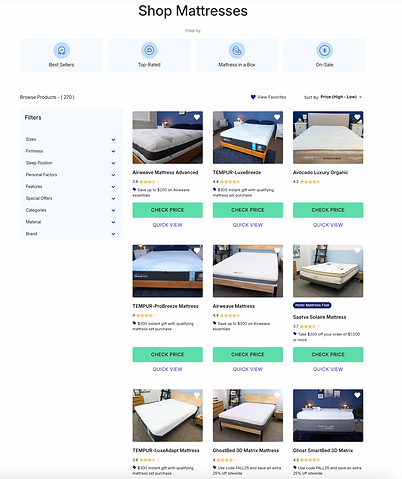
Quick View Card
We conducted a study specifically on the quick view card, which is intended to provide more in-depth yet punchy product information to customers.
Changes include:
-
Varying product details
-
Adding customer reviews
-
Linking to full product review
Category Filters
We heard mixed opinions from users about the category filters at the top of the tool, including critiques of the imagery used.
Changes include:
-
Removing filters
-
Improving image quality
-
Replacing filters with stylized icons

LEARNINGS AND FINAL NOTES
The sort and filter tool, ultimately branded internally as Browsing Tool, engendered high user satisfaction throughout UAT and user studies. In its initial 2 months live on site, volume was relatively low since there were few entry points into the tool. Once high-priority improvements were made, the subsequent entry point on higher-volume pages (homepage and roundups) led to meaningful improvements in volume to the tool and revenue. In its next 2 months (after being added to this pages), the tool saw click-through rates and conversion rates on par with the site's best performing pages.
In usage analytics after launch, users engaged consistently with the filters and the tool saw normal exit rates. Users in a post-launch study approved of the tool and had no consistent or passionate recommendations for improvements, saying they would use a tool like this on their journey.
The tool also forced our Content team to better manage the product information database where it pulled content and product details from. The layout of this product now serves as the skeleton framework as the quiz results page, which was an intentional consideration early on in the design phase.
An original idea for this tool was to integrate it with an early version favoriting tool, which users could use to create a list and track their favorite products. Users consistently liked the idea of this tool but did not notice it, and engagement was virtually nonexistent. Removing the favorites tool was the logical next step and helped to clean up the UI.